Hello!
My name is Marcy Traynoff and I'm a Graphic Designer in Northwest Ohio.
Let's get in touch! If you would like to know more about my work and how I can help you with your business design and marketing, please check out my portfolio samples below and download my résumé.
LOGO DESIGN
Fort Meigs
Fort Meigs analyzed its previous logo and discovered it only appealed to 20% of its target market. Fort Meigs needed a single identifier that communicates what it is and entices the public to visit. The logo needed to be fun and interesting, yet educational. Before I drew the first sketch, I conducted focus group sessions with questionnaires for all Fort Meigs employees and volunteers to help me capture the essence of Fort Meigs. The result of much research and observation is an active and dynamic symbol that will stand the test of time.
I created the logo illustration, typography and stationery (letterhead, envelope & business card). I also created a detailed Graphic Standards Guide to direct the logo's usage. There are logo versions for multiple scenarios, including: stacked, inline, color, black & white, grayscale, and with/without the tagline.
PREV | | NEXT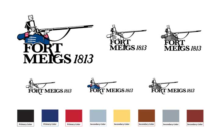
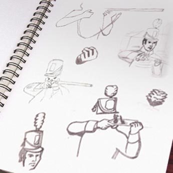
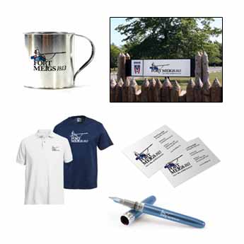
PHOTO MANIPULATION
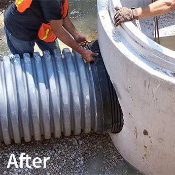
Advanced Drainage Systems, Inc.
I frequently perform custom photo manipulation for many of my clients to help them sell their products. In this case, the original photo needed to be retouched in order to make it more appealing to the target market. I removed the tattoos from the man's arms and added a sleeve to his shirt. I also erased the pop bottle on the right side of the photo.
PREV | | NEXT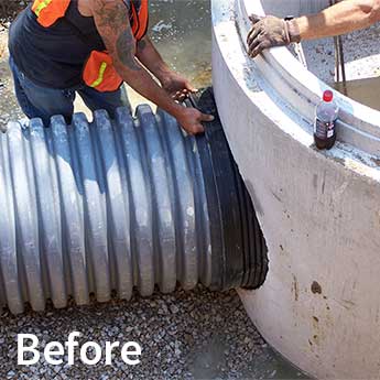
PRODUCT DESIGN: THE FISH EXTENDER
First2Market Products
This project is a perfect example of my zaniness and creativity. I came up with the idea for The Fish Extender as a new custom product to present to Cabela's, Bass Pro and Gander Mountain. A gag gift for fishing enthusiasts, it's a translucent silicone sleeve that slips over the end of a caught fish. Photographic evidence with The Fish Extender makes a "fish tale" much more believable.
I developed the idea, original product renderings, and working drawings for this product. I also designed the prospective packaging: an imitation fish net.
PREV | | NEXT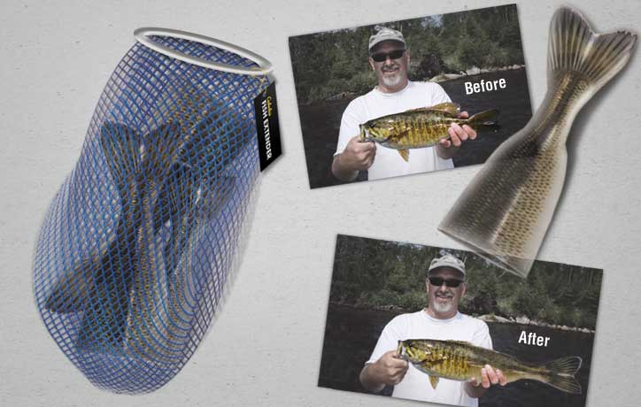
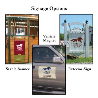
LOGO DESIGN
Maple Meadow Farms
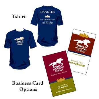
Maple Meadow Farms is a small startup business that sells registered miniature horses. The client wanted something clean, sophisticated and memorable, incorporating a maple leaf in the design. By the use of layout, hierarchy, typeface, and color choices, I created an effective logo that was everything the client desired. In addition, I designed T-shirts, business cards and signage for a complete package that is helping the client attract more business.
PREV | | NEXT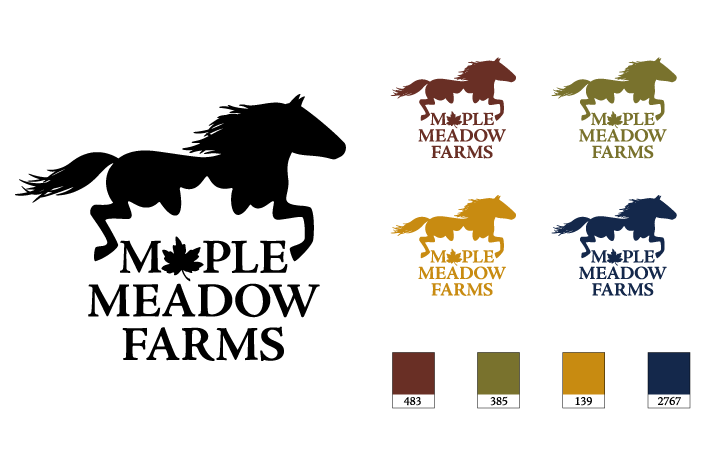
PRINT DESIGN
Personal
It's important to deliver great designs to my clients, and sometimes I need to be creative when we're working within a tight budget. Postcards are very budget-friendly (for designing and for mailing). I designed this postcard invitation for my son’s first birthday party.
PREV | | NEXT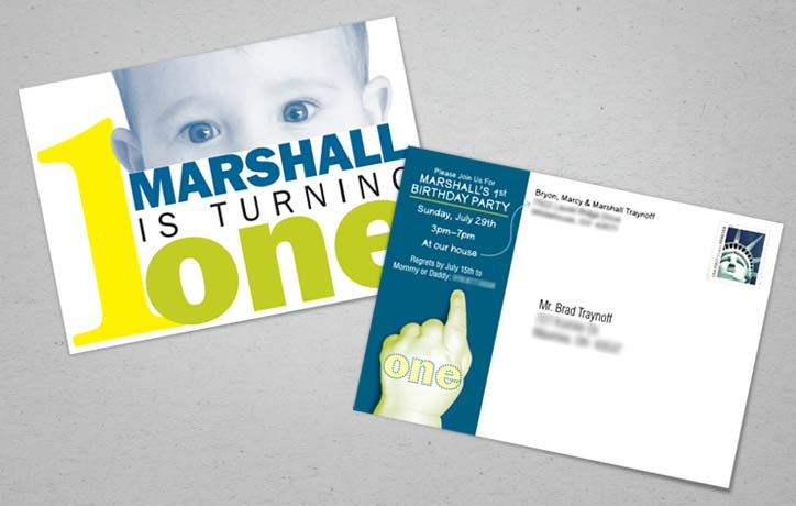
LOGO, BUSINESS CARD & BROCHURE
Health Wanted, LLC
Health Wanted is a new small business specializing in natural and holistic nutrition, counseling, and healing modalities. For the logo, the client requested Lily of the Valley, a very symbolic plant within the natural healing world. The desired colors were to have healing significance and establish a warmth lacking in many pharmaceutical logos.
I accomplished this task by nesting a stylized Lily of the Valley flower within a heart shape to symbolize the company's focus on individual wellness and caring. I established a color palette that is soothing, yet strong and effectively represents the company as a professional service. The colors used also have healing significance, as requested.
Both the business card and brochure layouts utilize white space to give them a serene and refreshing feel. The imagery within the brochure emphasizes the restorative nature of Reflexology and natural healing.
PREV | | NEXT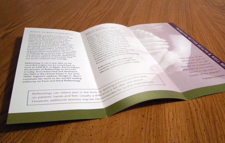


Like what you see? Let's connect!
All content property of Marloff Design. © 2008–2018 Marloff Design, LLC

